Pages

Showing posts with label tutorial. Show all posts

Wednesday, January 8, 2014

"Dividing" a Photo into 4 Pockets Digitally ... a Photoshop Tutorial


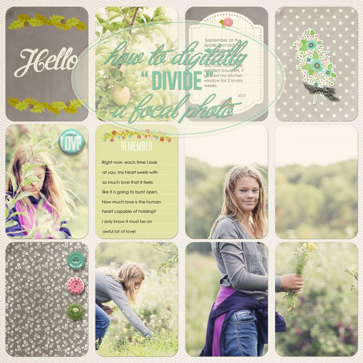
Hello. A reader left a comment asking how I digitally "divided" my focal photo into 4 different pockets on my Project Life page. Maybe some of you new to working with project life templates and/or digital scrapbooking are wondering how to do this as well.


 product credits:
little details: 
Creashens | Hello Flairs, Fling Elements (floral bouquet), Krafternoon Delight Elements (bow)
The Ardent Sparrow | Brand New Boy and Girl Kits (buttons)


It's super easy!

I am using Photoshop CC, but it's basically the same method in Photoshop Elements.

So you start with a template. The template I am using is Digital Project Life Template U. (link above)


Here I have the template opened in Photoshop and I've added the photo I want "divided" into 4 pockets. I've sized it and placed it exactly where I want it. In the Layers Palette, the photo is placed above the pockets that it will be "divided" into.


Now, since I know I want this photo to appear in four pockets, I simply duplicate the file 3x (so I have four copies total). Command J (on a Mac) or Control J (on a PC) is the easiest way to duplicate the layers. You can also go up to EDIT and choose Duplicate (3x).

NOTE: It is important that the photo copies all stay exactly where they are on the page. Do not move or shift them. You'll see why in a minute.
So, above, you can see my Layers ... and there are four copies of my photo. It doesn't look like anything has happened because the photos are all sitting on top of each other.


Now (see below) ... without moving the photos at all on the page ... you are going to drag (IN THE LAYERS PALETTE) each photo copy above each pocket that the photo needs to appear in. So each photo layer sits on top of each pocket layer. 


Here (below), you can see my 4 photo copies all nicely placed above the four pockets they will ultimately show in.

Now, move your cursor onto the space (IN THE LAYERS PALETTE) between the photo and the pocket. Click while holding down the ALT(on a MAC)/OPTION(on a PC) key. Your cursor will change into a bent arrow with a rectangle. The photo is now "clipped" to the pocket layer.


Once the photo is "clipped" to the pocket you will see your photo layer indented in your Layers Palette with a bent arrow.


Do this "ALT/OPTION click" to each of the other Photo copies. See my little black arrows below. I have 4 photos "clipped" to the pockets below them.

NOTE: Make sure the photo lies on top of the pocket it should appear in!

And that's it! The photo is digitally "divided" into 4 pockets. Now go finish your awesome PL page!


SOME TIPS and HELPFUL HINTS:


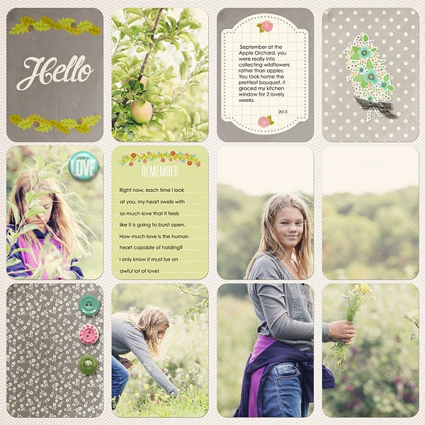
If you need to move the image around ... say a face ended up in the space between the pockets (like the example above) ...

in your Layers Palette, click all four photos at once. To do this, you click one photo and then Command click (on a MAC) or Control click (on a PC) to select the other three photos.
Make sure your move tool is selected, and then you can just drag the image around on the page until it looks good. Having all 4 photo layers selected, means that all four of them move together as if they were ONE photo. This gives you that "divided" look.

You can also re-size the photos by click/dragging any of the corners. If in Photoshop, make sure to hold down SHIFT to constrain the photo dimensions. I believe Photoshop Elements does this automatically.


It's a good idea to Lock your four photo layers together. This makes sure they all move together and that one does not accidently get shifted around. See below ... just click the Link Layers Icon at the bottom of your Layers Palette (while you have all your photo layers selected).


Once locked, each layer will have a little Chain Link Icon next to it. If you do not want them locked, simply click the Link Layers Button again to remove this feature.

That's it. I hope you give this a try. It's such a fun way to make one really great photo pop on your PL pages! Feel free to leave a comment linking me up to any page you create using this technique! I'd love to see your work! :)

xoxo- jenn

Thursday, November 29, 2012

Technique Thursday ... Add Drama to Your Photo's Sky and Reflections with Camera Raw


I don't know about you, but often I take a photo of a gorgeous landscape and when I look at the photo later on my computer, I am underwhelmed. Usually the sky is washed out ... it is just not as blue and bold as I had remembered.

 Unfortunately, your camera and your eye do not see things the exact same way ... but there are tricks and techniques to spruce up your photos. My usual go-to application is Photoshop. But I also love the ease, speed and power of Adobe's Camera Raw software. Let's call it ACR for short.


Here is a snippet of a digital scrapbook layout that I will be sharing with you next week. Imagine this series of photos with the washed out version of my landscape photo in the center frame, instead of this high impact version. It's such a tiny little series of photos, that the original landscape image straight out of camera, would have been lost among the other two bold, colorful photos. 

So, I turned to ACR to fix the image below, and help it better match the mood and feel of the other two images shot that afternoon.


In ACR, you can edit images that are not RAW files. The original image was shot as a .jpg. I use Adobe Bridge, shown below, to view and organize my photos. To open this .jpg image in ACR, I simply highlight my photo(s) in Bridge and press CMD R (CTRL R on a PC), or I can go to File>Open in Camera Raw.


This brings up my ACR window with the image (or images) that were highlighted.


I did some very basic editing and straightening of this photo. I'm not going to go over all the edits I would do in Camera Raw in this mini lesson, but I highly recommend Lynda.com for training, if you are interested in learning more about this program.

The purpose of this tutorial is to focus on how we can quickly and easily add some real drama to our sky and our sky's reflection in the water. To do this, we are going to use the Graduated Filter Tool (G), shown below in red.


Once you click on the Graduated Filter button, your ACR window will change slightly. A new right side panel will be displayed.


For this image, I want to work with the sky (top half of the image) first. Holding down Shift (this will keep your line straight and thus the filter overlay straight), click on the very top of the photo (green circle), or slightly above it, and drag to the area where you want the effect to end (shown with the red circle). I choose the mountains at the horizon line.

Then start to play with the sliders in the right side panel. So, for this image, I know I want to increase my colors and saturation of the sky. I don't want the sky to be so bright and washed out. I moved the Brightness slider to the left to decrease the brightness and darken up the sky. I also increased the saturation and contrast, by moving those sliders to the right. Play around to get the effect you find pleasing.

Below is a random example of the panel, and its sliders, close-up. These are not the settings I used for this image. I just wanted you to be able to see the details.


(The settings I settled on: -84 Brightness, +43 Contrast, +40 Saturation and +6 Clarity. I really wanted to almost "over-do" the effect for this tiny photo. I needed it to better match the intensity of the two other images. If this photo were to be blown up or printed and framed, I would have definitely toned it down!) 

* Remember only the pixels in that red to green zone will be changed, and it is done gradually from green/darkest or strongest effect down to the red/lightest or weakest effect. 

Once you are happy with the sky, click on the New button in the right side panel, to set the sky's graduated filter and begin working on a new filter for the reflection in the water. See image below, the red/green dots have gone white, indicating they are "set" and that you are now ready to create a new graduated filter.


Now, let's create the Graduated filter for the reflection using the same series of steps. Since this is a reflection, we will reverse our starting point (green circle) and place it at the very bottom of the photo or slightly below. This will be the darkest part of the graduated filter's effect. We want it to mirror what we see above in the sky. So, holding down Shift, click near the bottom of the photo (my green circle) and drag to the point where you want the effect to end (my red circle). I choose to end my effect near the horizon, where the water meets the mountains. The end click is the red dot and the lightest of the graduated filter's effects. See my red/green clicks below.


Again, play with the sliders to get the effect you want. For my photo, the tree on the right gives me some valuable information about the lighting in my photo. The tree branches and leaves on top are much lighter and brighter than the ones near the bottom of the photo. So I choose to make the water area even deeper and darker than the sky. I moved my Exposure slider to the left to make the water graduated filter darker than my sky.

(The settings I settled on: - 15 Exposure, -80 Brightness, +43 Contrast, +35 Saturation and +6 Clarity.)

*Note: Your filter lines do not need to be a straight line, up and down. You can drag at angles. You can drag across the photo (ex. left to right). If you do not want a straight line, do no hold down the Shift key. Experiment. Play. You can also use this technique to lighten photos that have been underexposed, by increasing the Brightness (and perhaps the Exposure slightly). 


 My final landscape image using just a few clicks in Camera Raw. Blue, bold and beautiful!

If you decide to give this a try on your own photos, I'd love to see what you create! Feel free to share a link!

Hope you enjoyed the tutorial.
xoxo -jenn

Thursday, October 4, 2012

Technique Thursday ... Photoshop Tutorial : Recolor Part of Your Photo to Match Your Digital Layout

Earlier this week I promised a tutorial showing how I changed the color of my son's shirt in a photo to match the rest of the page. Here is the photo with the orange shirt (and a frame) that I will be using on my page.


I need the shirt to be a shade of red to match the digital kit that I want to use to tell my story of this photo, looking back 7 years later. The color is not as important to me as the meaning. This is something you will have to decide for yourself, if you wish to alter your photos in such a way. (This is the way I first learned to do this, please know there are many, many ways to achieve this simple task. If you have a better way or another way ... please feel free to share in the comments.)

We'll start by creating a Hue Saturation Adjustment Layer. You can go to Layer, Adjustment Layer, and then pushing OK. Or you can go down to the circle that is half white/half black at the bottom of your Layers Palette, as shown below.


Once your Hue Saturation Adjustment Layer is there, you need to clip it into the photo, so that the color changes are only applied to the photo layer (not the frame, or any papers or elements underneath it that end up on your page.) You do this by hovering your cursor over the line between the photo layer and the Hue Saturation Adjustment Layer, and then clicking Opt on a Mac, Alt on a PC.


Your layers palette should look similar to this. With the little angled arrow showing the Adjustment Layer "clipped" into the photo. In my example, I also have the photo clipped into the frame's mask and the frame itself below that. If you are just working on your photo directly, your photo will not have the angled arrow showing that your photo is clipped to anything.

Now lets look at the Sliders within the Hue Adjustment Layer. Here's where you play around with the sliders to achieve the look you are after. You can click where it says Master, and you will see channels for Red, Green,Blue, Cyan, Magenta and Yellow and you can tweak the sliders for the colors individually. For this orange shirt, I opted to leave the setting on Master.


Start with the Hue and only focus on the changes being made to the shirt because all the colors will start to change. We'll fix that later. Slide the Hue slider until it starts to get into the color you are looking for. Once I got to a red that I sort of liked (-25), I moved down to the Saturation slider. I needed to increase the saturation of my red so I moved my slider to the right (+13). Last, I needed to tweak the lightness and make that red a touch darker (-14). Be careful when playing with your lightness & saturation sliders that you don't over tweak it to the point that you lose all the details and shadows.

Now we need to create a mask so we can block the color change everywhere except the shirt. We do not want that reddish hue on the skin, the grass, the corn, etc. While still on the Hue Saturation Adjustment Layer click the mask button at the bottom of your layers palette. It's the one that looks like a grey square with a white circle inside, right next to the Hue Sat button.  Press "D" (for default) to make sure your foreground/background colors are white and black. Then press CTRL and "I" to fill the mask with black. (This inverts the entire mask, from white to black.)


In the example above you can see the Hue Saturation Adjustment Layer with the newly created mask filled with black. The photo looks just like it did before we started playing with our sliders. But don't fret. With masks anything painted black is hidden ... black conceals. And conversely, anything that gets painted with white is shown ... white reveals. So right now our entire hue saturation edits that we made (the red tones) are hidden by the mask because it is completely painted over in black. We are going to use our Brush Tool to paint (with white) over the orange shirt to reveal the red. To make sure we are in fact painting on the mask click the black mask. You'll see little black lines surrounding it to indicate it is "selected".

Press "B" for the brush tool and select a small hard edge brush. Use your "[" key to quickly decrease the size of the brush, and the "]" key to increase the size of the brush. We pressed "D" earlier to ensure our colors are set to default. Our foreground should be white. Zoom in on the shirt (or whatever area it is within your photo that you wish to reveal the Hue Saturation Adjustment Layer) and just start to paint.


You can see the red starting to show through the mask. Remember to increase and decrease the size of your brush to get in close and get crisp lines. If you make a mistake, like paint over the arm accidentally, simply press "x" to swap the foreground color back to black to conceal your mistake. Then press "x" again to continue painting in white to reveal the red. 

And here is the finished photo with the shirt "painted" red. The skin and corn and grass are all as they should be. You can also see the bits of white (the parts that are "revealed" in the mask up in the layer palette. 

Note: There are lots of selection tools in photoshop that will help you achieve these type of selective adjustments as well. For something simple like this shirt, I find it easy to quickly paint it in by hand. 

Here is the final scrapbook page. I think the red shirt looks much better, than had I left it orange. What do you think?


I hope you enjoyed this quick photoshop tutorial on how to do a selective color change within your photo. 

-xoxo jenn

Thursday, August 2, 2012

Technique Thursday V.3 Making an Artsy Background

I thought I'd share how to make a multi-layered artsy background, just like the one I did for my "Life Is Brighter With You In It" page. This type of background, where it transitions from b&w to a bold, burst of bright color can be used for so many themes, and so many types of photos.


I started with a 12" x 12" file in Photoshop using Nancie Rowe Janitz's Art Journal Pages.


I filled the 12 x 12 layout (LO) with a few of her pages like so:


Here is what my layers palette looks like.


I used Nancie's Polaroid Transfer Masks to mask each Art Journal page onto my 12 x 12 layout to give it a more blended edge where the various Art Journal Pages meet, rather than having a hard edge.

Once my background was set the way I like it, I saved it as a JPG and dragged it onto a new 12" x 12" file.

Here I knew I was only going to have parts of this "background" paper visible, so I needed a neutral paper to be my absolute background. I chose a lovely paper from Nancie's Hopeful Art Paper pack. (I used the one on the top row all the way to the right.)


So there is my background paper, and on top of that you can see a mask that I added from liv.e design's EZPZ 08 Template: And Then. (Love this mask!)  I just dragged a couple of copies of the mask onto my LO and placed them along the edges, merging each of the masks on the right side together, and then the left side together.


Here are my layers palette again. (My layers also show the background that we created in the previous step with the Art Journal Pages. There is a background copy clipped to each mask, at the moment those layers are turned off so they are not visible. See next step to see them turned on.)


And here is the page with a copy of the background that we made earlier clipped to each mask. The one on the right side, I simply removed the color by desaturating it.


But I realized I wanted it to go black and white ... to color, so I flipped it.

Ahhh! Much better.
That's the look I was going for.


And then I realized that I really liked the background paper (The Hopeful Art paper) with its bits of scruffy text and wanted more of that to show through, but I didn't want to compromise the masks with the Art Journal Pages. So I duplicated that Hopeful Art background paper and dragged that copy up to the top of the layer stack. I turned it on its corners, like so:


I used the Multiply Blending Mode and added a Layer Mask and painted with Black on a low opacity to hide much of the paper (especially the ugly hard edges), but blending in some of that nice scruffy text. Here are my layers again:


 And here is my final background.


It's a small change ... adding that duplicate copy of the Hopeful Art Paper. Blending it into the image wasn't necessary, but I felt it was worth it and just gives that little extra bit of depth to the overall background.

And here is my layout with photo, and all the little details.


Hope you enjoyed today's Photoshop technique. Would love to see a link to a page you create using this tutorial, so feel free to share!

thanks for checking in. xoxo -jenn


Thursday, July 26, 2012

Project Plaza ... DIY 3 Tier Craft Stand Tutorial

Well, I was hoping to do a Technique Thursday Tutorial today on how I created the background for my Life is Beautiful with You in it! page. But time was not on my side this week. I've been busy driving up to 3 hours a day taking kids back and forth to camps and evening activities. That leaves very little extra time for me. I do have a fun announcement though!

JessicaSprague.com recently launched a new series of hybrid project tutorials called Project Plaza. Today my first project, 3 Tier Craft Stand Tutorial, was released. You can read more about it and purchase it here if you like!


I'm working on the tutorial for my next project as we speak, so tune in August 6th to see what else I have up my hybrid sleeve. ;)

And hopefully I can find the time to get that Technique Thursday Tutorial up next Thursday. 

take care. xoxo - jenn

Thursday, July 12, 2012

Technique Thursday V. 2 Iphoneography Mini Tutorial


If you have an iphone and love taking photos, I'm pretty sure you love the handiness of the built in camera. I know I do. So much easier at times than lugging that DSLR everywhere. (Shhhh, don't tell her (my DSLR) that I uttered those words!) And if you love taking photos, that probably means you have a ton of apps, like the popular Instagram and Hipstamatic, that you utilize to pretty up your precious pics. Today, I want to share 2 other apps that I use all the time to get some really cool effects with my iphone photos.

The first is Camera + . You can find the app here at campl.us or download it from the App Store.

I use this app as my main camera, instead of the built in app that comes with the iphone. I like the zoom, focus, and exposure features and I love all the editing options. Visit the website to learn more.

So I took this photo during our first week of summer vacation. I don't love the photo because the people I care about are kind of far away in the picture (in the lake) and I didn't want the focus of the photo to be about the random people in the foreground. I wanted to remember this photo for its moodiness ... its summery feel, for the beginning of many weeks of sun, swimming and friends! So I made some quick edits in Camera +. I invite you to follow along with me today. Here's my recipe:

Step 1: Use Camera + to take a photo.

(boring Original photo of random people at the Lake.)


Step 2: Retrieve photo from your album/camera roll (wherever your pictures default to once you snap). Choose Edit. And apply the Clarity Filter. (Sometimes this filter is a bit too harsh, but here I knew I was going to be applying lots of effects/filters so I wasn't worried about it.)

(photo with Clarity Filter applied in Camera+)

Step 3: Choose Crop. Choose Square from the options. Position your square grid over the portion of the photo you want to keep. Anything outside the faint square grid will be cropped out or deleted. I choose to position my square grid more to the right of the photo to include that fun, summery beach umbrella!

(photo Cropped into a square and positioned as desired)
Step 4: Choose FX effects. Choose Color from the options. I used Magic Hour. You can adjust the intensity to your liking. I left mine at 100%.

(look at that nice, golden sunny hue that the Magic Hour filter provides!)

Step 5: Choose Borders. Choose Simple from the options. Select Round White by tapping it.

(the image is starting to look a little more interesting)

Step 6: We are finished with the Camera + editing, so select Done (top right) and Save the image.

 (Here's a detailed image of iphone screen with Camera+. You can see the Crop, FX Effects and Borders editing tools.)

Next, I used a handy little app called ScratchCam, which can be found at scratchcam.com
 or in the App Store.


This app gives your photo a Vintage or grungy feel and is really fun to use. There is even a random feature which will let you randomly flick through different effects to alter your images in unexpected ways. Visit the website to learn more about this app.

Step 1: While in the Scratchcam app choose Album and locate your image that you just finished editing in Camera +. See photo above for where to find this option.

Step 2: Your image is loaded with a random effect applied. You can select RAND to keep scrolling through random effects. You can select FX to apply them yourself. Or ... to remove the effects, locate the slider on the top of your screen and slide it to the left to undo the effect or simply select Undo at the bottom of the screen. Since we are going for a specific look at the moment, go ahead and Undo whatever random effect was applied.

(this is not our image, but I wanted you see the iphone screenshot from Scratchcam, so you know where the options are)

Step 3: Select Edit. You will see a new screen pop up with the following options: Scratches, Textures/Borders, and Colors. I choose one from each category. If you do not Undo the effects, they will layer over each other ... creating a nice multi-layered effect. Unfortunately the app doesn't really indicate what the names of each scratch, texture or color are .... so it is very difficult for me to tell you exactly which ones I used. But play around with them until you get something similar to my final photo. I choose scratches without all the black edges and a lighter, brighter color effect. My texture gave the final image a nice vintage feel.

 (here you can see the screen shot of the Scratches, Textures/Borders, & Colors filters when you choose Edit. lots of grungy and vintage goodness to choose from!)

Step 4: When you have the look you are going for, Hit Edit to go back to the Main Screen. Hit Send to save the photo. You can also send it Facebook, Twitter or email to share your snazy new iphoneography image!


And here is my final image ... all grunged up with the Scratchcam and Camera+ apps! Have fun playing. Hope you enjoyed this little Iphoneography tutorial!  -xoxo Jenn

ShareThis

Related Posts Plugin for WordPress, Blogger...